We are a group of creative people who help organizations make their ideas beautiful.
AN INCLUSIVE ARTS DESTINATION AND CONCERT VENUE
The Sheldon
A Brand and Website Without Borders
CHALLENGE
SOLUTION
SERVICES
HOW IT HAPPENED
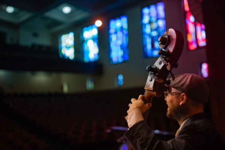
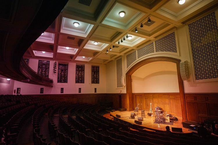
Starting as a concert hall which Tony Bennet said had the, “best acoustics in the world,” The Sheldon grew throughout the 1990s and 2000s to host not only music, but visual art, education and private events in St. Louis’ Grand Center Arts District.
But its diversity of offerings sometimes felt like disconnection. How could they communicate all of their events and services with one cohesive rhythm? As their partners for over 25 years, they trusted us to help figure it out.
We wrote a new brand story, brand pillars, key messages and a tagline that cracked The Sheldon wide open: Arts Without Borders.
This platform was then visualized. The new logo, an almost edgeless cube, represents how Sheldon patrons are often invited to challenge their perspective, and experience art more fluidly.
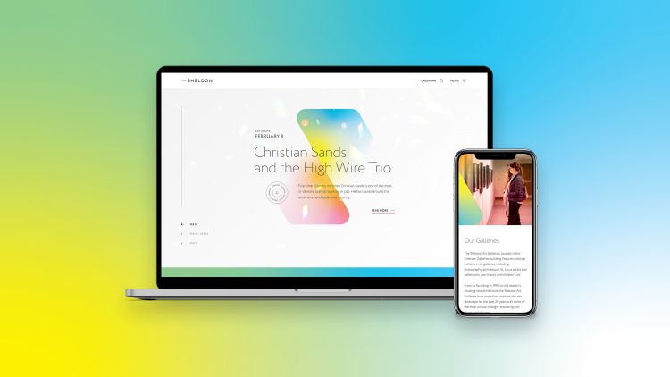
After the visual identity, came the website build. An open, yet stealthily persuasive design, a best-in-class event calendar, clear user pathways and compelling content brought The Sheldon up to par with, then right past its competitors.
And the seamless web experience didn’t sacrifice usability. It earned an outstanding accessibility score (92/100), ensuring Arts Without Borders was truly open to anyone who wished to experience it.


Each page on the new site is thoughtfully curated to engage users in Arts Without Borders on their terms, leading them to discover ticket sales, donations and educational concert attendance.


