We are a group of creative people who help organizations make their ideas beautiful.
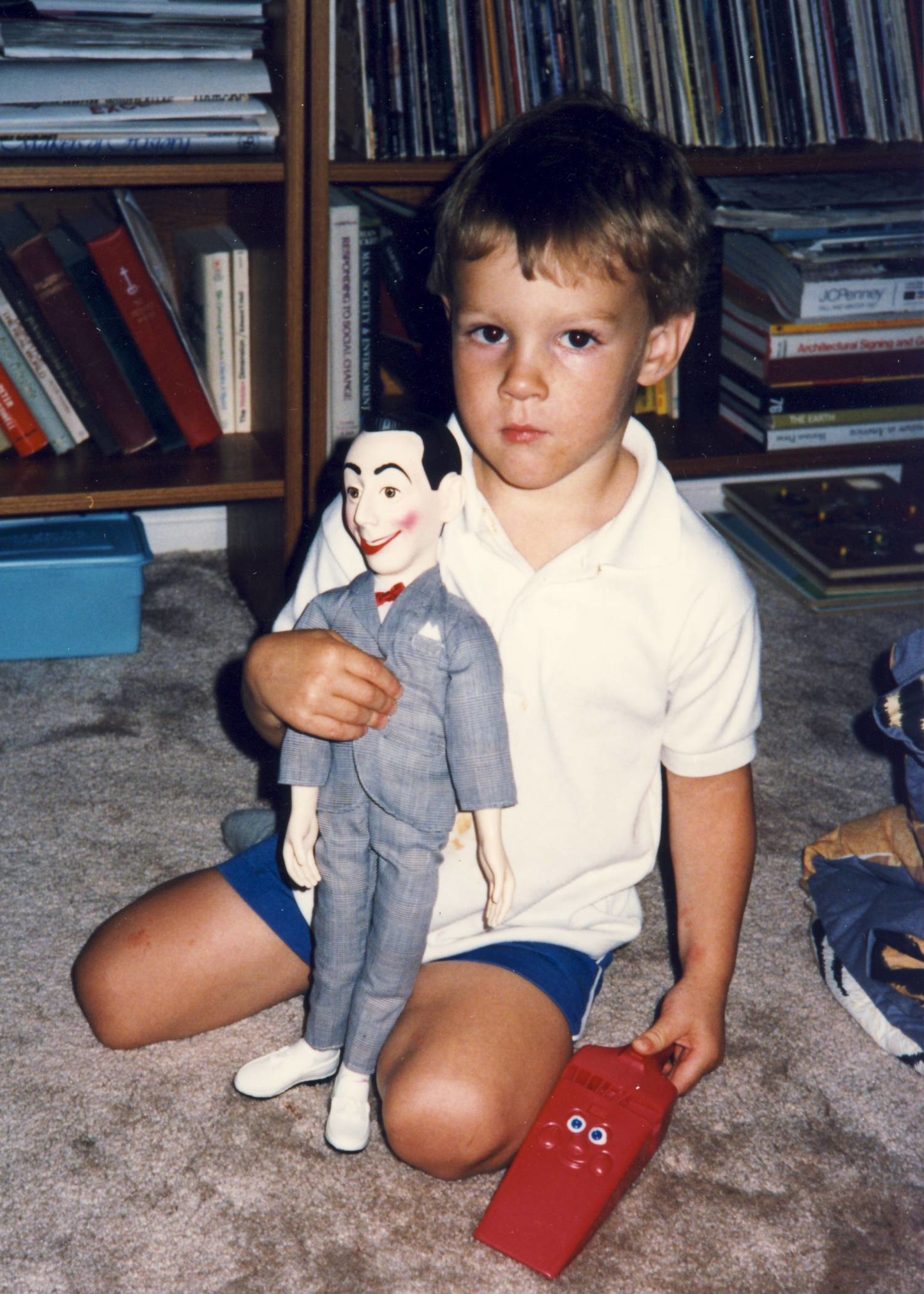
Jon
Simons
First AOL Instant Messenger Name: JNCOJon123
Jon, Carrie and I recently realized that when we go dancing (which is just often enough to know we don’t need to do it again for another year), each of us leads our movements differently. Carrie dances with her entire body, I dance with with my legs and Jon dances with—his head. This should come as no surprise because Jon is one of those people whose hearts is inextricably tied to their brains. And the entirety of this brain-heart is in love with St. Louis.
As I’m interviewing Jon at local bar Tick Tock Tavern, he runs into no less than three friends and it’s a regular old Tuesday night. That’s Jon’s life in a city whose future he’s as excited about as his own.
“Right now, there’s a rebuilding of St. Louis. It’s kind of a blank slate that our generation is helping define, and it’s nice that I know a lot of the people who are doing it. Like every city in the world, we have problems. But we have a new mayor, property value is going up. We have a lot of tech moving in St. Louis, and new streets are popping up that… are hip to visit.”
As a Senior Art Director (a title whose acronym, he points out, is SAD), he has found several ways to intersect his talents with the growth of his hometown. If you’re walking down Cherokee, one of these “hip to visit” streets, you’ll likely see Earthbound Beer. Part flaming asteroid, part brand initials E and B, this logo is all Jon Simons.
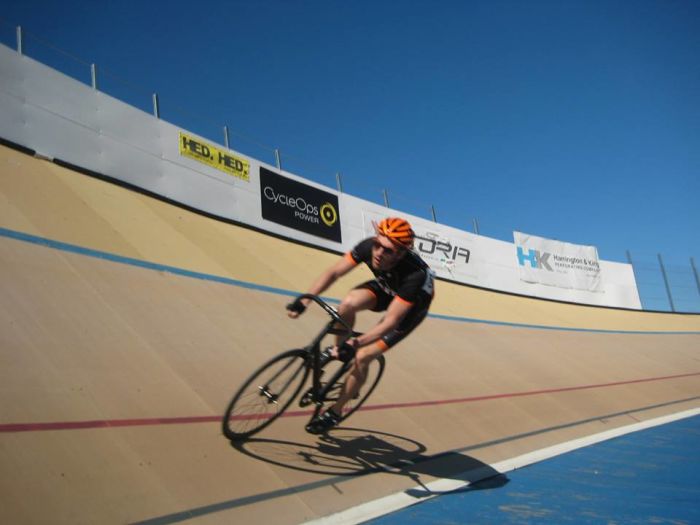
Sprinting to qualify for a Match Sprint race at the now-closed velodrome in North Chicago, IL.
A St. Louis brand he’s dying to get his mitts on?
“I would love to work for Red Hot Riplets. Are you listening, Gus? Getting paid in savory, barbeque-y goodness wouldn’t be so bad.”
First trending hashtag: #TypeofSTL
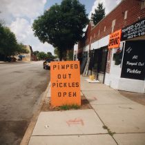
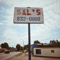
Jon loves biking as much as he loves the color orange (“There’s a cool orange Subaru. I could have had an orange car. *Guttural sounds of lamenting* I could have been that guy!”) Biking makes his brain a little quieter; a little more peaceful. It also is a way to explore his favorite city. And it led him to posting #TypeofSTL on Instagram.
“I figured out that no one was really cataloging all the signage of buildings that were getting knocked down. Some of this stuff is hand-painted, too. I just kind of took it on as my duty, and other people have started to join me.”
There are a slew of signage landmarks that Jon ticks through with affection. One of his favorites can be seen driving (or biking) down 55, right between Lafayette Square and Soulard. It’s an End Eminent Domain Abuse Sign. Or is it? “The thing is, the sign is completely wrong. Because it says End Eminent Domain Abuse, but the sign is marked out with one of those circles with a line through it. So it’s a double negative. I don’t know what they were thinking. I bet whoever painted it knows it’s wrong now, but it’s so classic they can’t fix it. It always gives me a chuckle.”
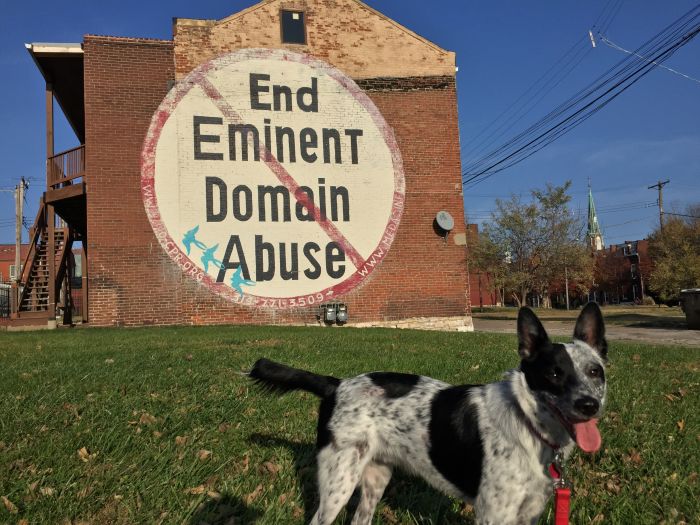
The landmark End Eminent Domain Abuse sign with the farm to city convert, Jazz.
Jon hopes that this project inspires people to embrace the entirety of St. Louis. “There’s a ton of great signage in North City, which some people are afraid to go. That’s so crazy to me. Maybe some people will never see these treasures in their own city because of some strange fear of going across the Delmar Divide, but they should. They should go see it for themselves.”
Though this is a project of passion, it is ruled by these self-imposed brain-heart guidelines. When Jon adds to #TypeofSTL, he must:
1.
Be on his bike.
2.
Shoot the type with his iPhone—whatever version he has, cracked screen and all.
3.
Edit the photo using mediocre phone app.
First AIGA Judge’s Pick and ADDY Gold
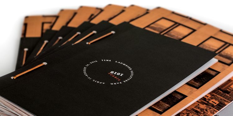
Of course Jon’s most-awarded project was one for a St. Louis institution. Laumeier Sculpture Park asked Paradowski to create a paper pamphlet housing essays on an exhibit by visiting New Delhi artist, Gigi Scaria. Jon spent hours pouring over Scaria’s work and decided to make the piece not only talk about it, but mimic it.
“I just couldn’t stop working on this project when I left work for the night. The book is made of 4 separate books of varying sizes. The layering creates a cityscape that represents Scaria’s vision for his own work. They’re all brought together with copper box staples that you find in warehouse boxes.
I really wanted to print the book on paper trash from New Delhi, buuuut logistics got in the way. It was a challenge to print even on regular paper, and the printer kind of freaked out about it. The hurdle was binding, but these copper box staples were an innovative and simple solution.”
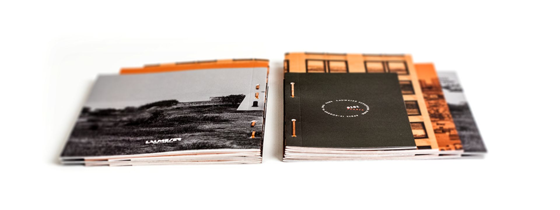
A trained cross-country runner and track bike racer, Jon takes the same momentum to his design work. He is terrified of mailing it in and tells me, “The dog doesn’t need to be let out just yet!” And so, Jon decided that this cutting-edge booklet needed a companion piece. Jon designed a microsite to accompany this book of his own volition. It is equally impressive, and our district of ADDY judges thought so, too. It also won “Judge’s Pick” at the AIGA Awards show. Woot woot!
Last Words
of This Interview
CS:
What’s your favorite font?
JS:
Okay. It’s called Din. It’s a German sans serif and it’s my go-to to begin every logo and every wireframe. It’s just really nice because there are so many weights. I always start with it, then work on visuals and layout, then go back and tweak the font for whatever works for the brand. It’s so good to have a typeface that you don’t have to think about and use as an inoffensive placeholder.
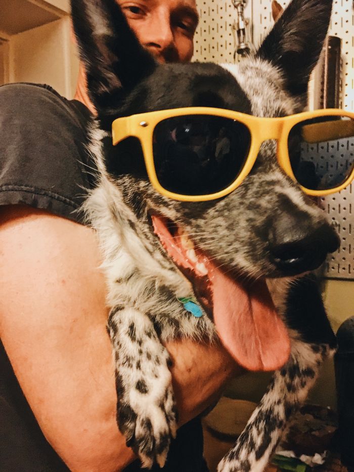
Jazz has always been cool. Cool Jazz.
CS:
How do you stop yourself from falling into the trap of design trends?
JS:
There’s definitely a web 2.0 thing going on in design. It’s a Dribbble effect. I find that taking a walk around the St. Louis art museum is super helpful. I’ve been into pulling from African art recently and applying that to a modern look. I’m mixing those line weights and styles with something unexpected. Sure, I go to “those sites” daily, but it’s nice to take your weekends to go learn the old-fashioned way.
CS:
What do you see yourself doing in 10 years?
JS:
Well, I will own an electric car. Hopefully I’ll be 49% faster at coming up with the most amazing concepts ever. 49%. No more, no less. I actually thought I was going to be a computer technician in high school, and I’ve never stopped loving the feeling of solving problems. It’s the feeling you have after you eat a really good cheeseburger. You know?

