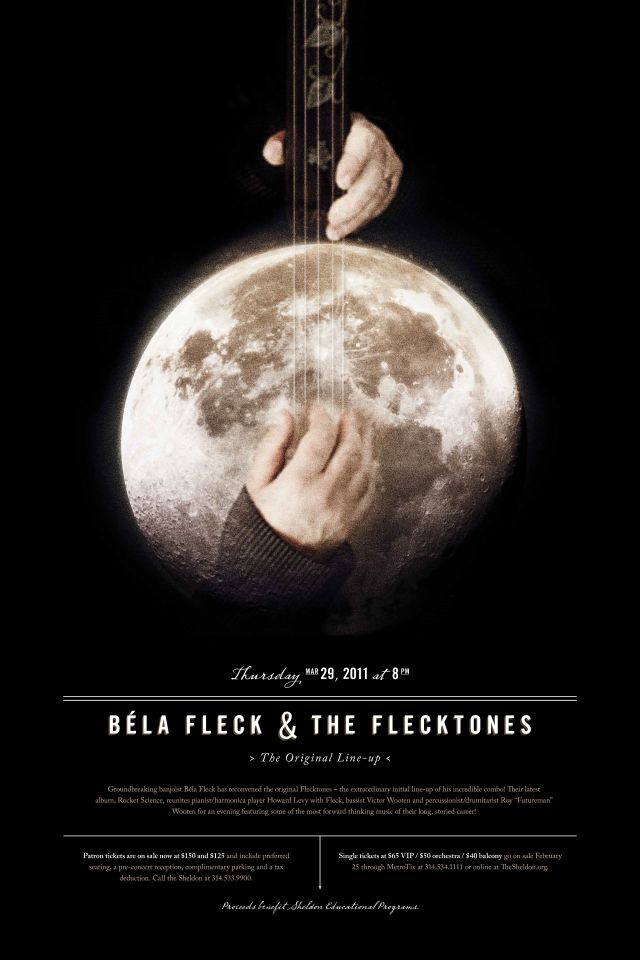
We are a group of creative people who help organizations make their ideas beautiful.
Here’s the thing about Andy Wise.
You know that scene from The Matrix, where Keanu Reeves is on the rebel spaceship with the fat computer cable shoved into the back of his head?
The one where whole terabytes of data related to combat training are being pumped directly into his brain and then, after a couple of minutes, he turns toward Laurence Fishburne and says: “I know Kung Fu”?
Well, that’s pretty much how Andy lives his life, except instead of Kung Fu, it’s things like generative design and computer code and robotics and public speaking and management theory. It might also be Kung Fu, for all we know. And instead of having it downloaded directly into his cerebellum, he somehow manages to pick it up organically, through his eyes and ears. Over and over again, you find he’s become extremely good at something it seems like he just started.
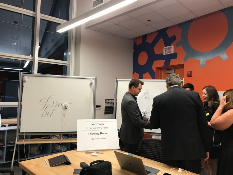
One day, Andy will casually mention that he’s been toying around with the 3D printer at his local public library. A week later he’s demo-ing the robotic drawing system he built using 3D-printed components, a Rasperry Pi, some fishing line, a hobby servo, a couple of stepper motors and a Magic Marker.
You watch as the robot inches slowly over the surface of a whiteboard, sketching a perfect, three-foot-tall image of your male boss wearing high heels and a negligee.
And you think: “What is happening here? Where did he find the time for this? I don’t even have energy to put the clean laundry away.”
It’s kind of maddening. And if he wasn’t on your team, working for your agency, you’d probably be looking for ways to hate him. As it is, most of us just watch with happy stupefaction. He’s a once-in-a-career kind of colleague, and exactly the person you’d want to help your agency navigate the confluence of design and technology.
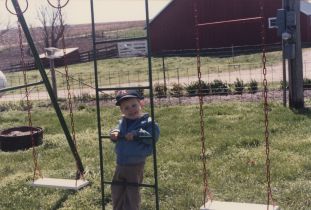
When Andy was a kid growing up in Topeka, Kansas, he would sometimes attend church with his Grandma Lavera in nearby Linn, Kansas (population 395). When things got boring, his grandmother would hand him a Bic pen and small pad of paper she’d lifted from the local bank, and Andy would just draw. He’d study the wooden altar and try to capture the exact shadings of light that played over the carved spires, Jesus’ draping robes, the beatification expression on his face.

A page from Andy's first grade journal. His teacher, Mrs. Johnson, was an early and profound artistic influence.
He drew and drew and somewhere along the way it occurred to him that this might be the way to spend his life. By the time he was a teenager, it was pretty clear he was going to be an artist of some sort.

Andy as a teenager photographing the Flint Hills somewhere between Topeka and Manhattan, Kansas.
Around the same time, he fell in love with technology. At first, this looked like the same run-of-the-mill fascination most boys have with machines: the desire to tear the lid off and figure out what the gears and wires are doing. But with Andy these mechanical autopsies also resulted in a strong desire for revivification—he wanted to bring his own creations to life. He began building computers and writing basic code. The ability to make things move in virtual space was instantly intoxicating. The internet was still the Wild West. Being a designer who wrote code was like being the mayor, sheriff and judge in the Dakota territories in 1875, all rolled into one. You had the power to design a whole new world according to your own rules and tastes.
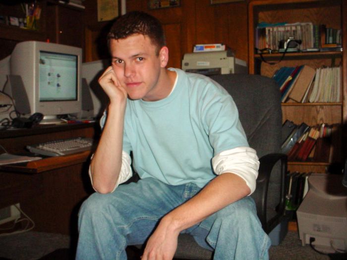
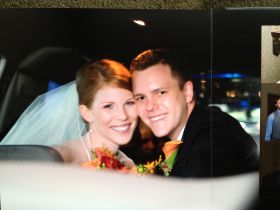
Also around the same time, plus or minus a couple of gangly high school semesters, Andy fell in love with Caroline. He was the sk8ter-chic, whiz-kid art student, she was the impossibly beautiful, impossibly smart cheerleader. It was exactly that improbable, and exactly that charming; I’ve seen the prom photo. Andy and Caroline matriculated to different colleges. She went to Kansas State, he went to Maryville. But after college they got married and now live just outside Kansas City, Kansas, where they are raising three young sons.


Andy is approaching his mid-thirties, but could easily pass for 28, or a slightly under-slept 25. Advertising is an industry that can age people, fast. But Andy seems to be Benjamin Button-ing; he looks younger every time you see him.
The day I interview him for this article, Andy is wearing a baseball cap with a large yellow ‘H’ on it (the H is for Harvard, where his brother-in-law recently graduated from business school) and that clothing staple of the 21st-century creative, a dark grey hoodie.
Andy’s speaking style is calm, measured, direct. There aren’t many “ums,” “uhs” or “you knows.” He’s ok with long silences as he thinks about what to say. I’ve worked with Andy for more than six years now, and he and I often joke about the differences between our thinking and speaking styles. I tend to talk in long, elaborate, abstract harangues, searching like a miner for a decent idea or rhetorical point. Tap, tap, tap, tap and, eventually, pay dirt. Whereas, Andy thinks and speaks like a heat-seeking missile. He will sit and listen, sit and listen and sometimes you begin to wonder if he’s even paying attention. Then, out of the blue, he will offer a single-sentence idea that hits right to the heart of whatever you’re trying to figure out.
For instance, during our interview, I wanted to ask him about how the democratization of technology and the destruction of 20th century business models have combined to create a tidal wave of sub-standard content that we all have to sort through without the aid of authoritative curators. My question (which was more of a diatribe, and not a question), rambled on for more than 70 seconds. Here’s Andy’s response: “Yeah, one day we’ll probably be starved for quality, not access.” Boom. Silence. Next question.
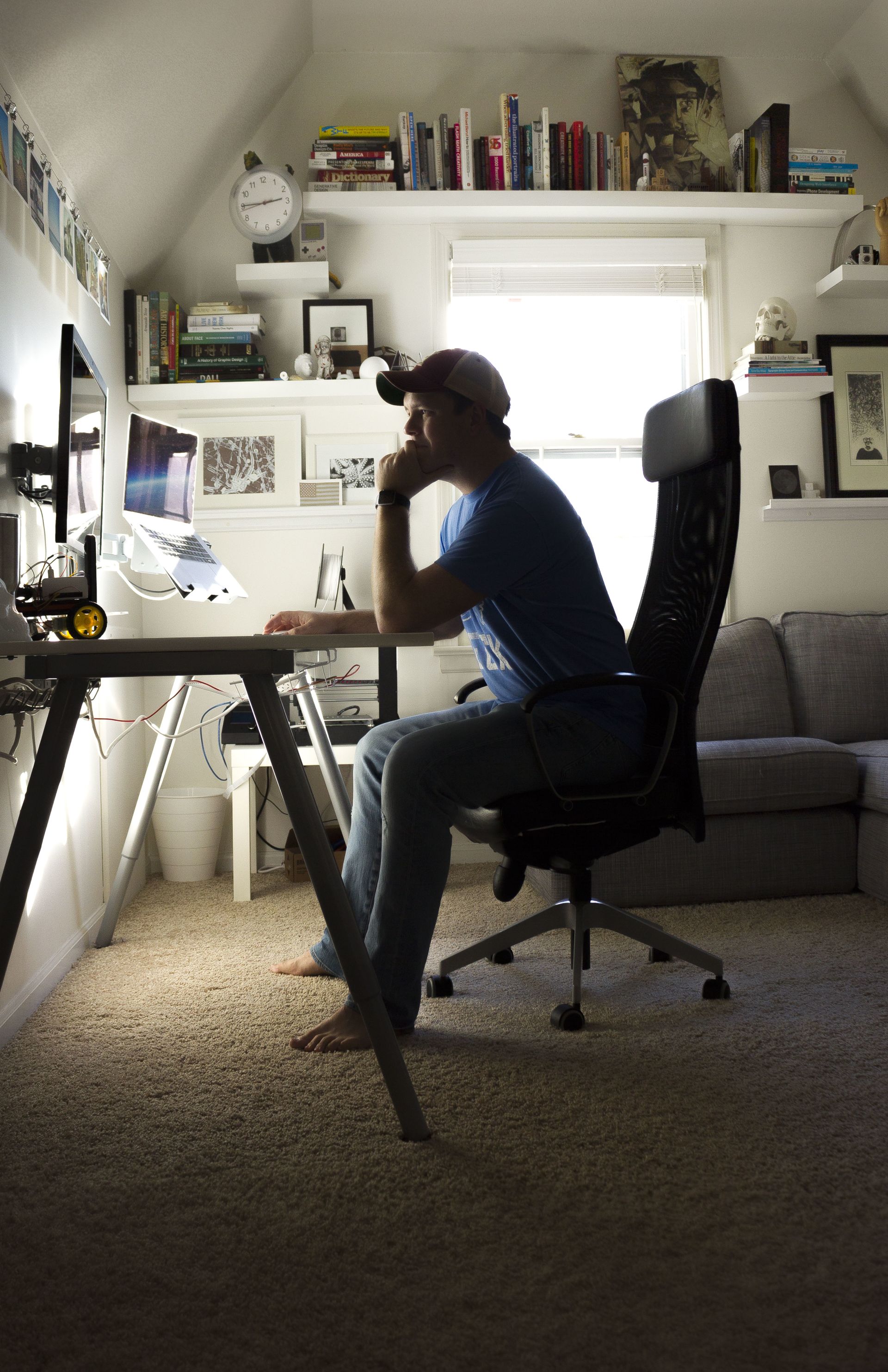
But, in response to other, better-formulated questions, Andy was incredibly effusive. Design is not just something Andy does, it’s something he thinks about philosophically. It was fascinating to tear the lid off his talent and see the gears and wires that make the whole thing work.
BH:
So, first question: Why do you think design is important to the world?
AW:
Oh, man. I totally should have prepared for this interview better. Design is important because there is a lot of aesthetic ugliness in the world. And I feel like it’s the role of designers to help clean that up. You can pretty much ask any designer that’s had any kind of training or spent any time doing design: once you look at the world through that lens, you can’t stop. You can’t unring that bell. And once you start looking that way it makes you really want to fix everything that’s wrong in the world, design-wise. I also think we’re all wired to respond to things visually. So it can be one of the most powerful communication tools we’ve got. It sort of destroys the barriers of language and cuts to the core of things pretty quickly.

"How many of you have at least one eyeball?" Andy asks the audience during a 2017 Webster University panel presentation titled "10 Truths That Won't Change With Creative Agency Trends." Joining him on the panel are fellow Paradowski Management Team members, Melissa Galazka, Brad Hauck and Gus Hattrich (from left to right).
BH:
As a designer, how do you navigate a world in which a lot of things are either not designed or poorly designed?
AW:
I think for most people, they don’t care that much. They’re content to have things that are poorly designed because they just don’t expect anything else. But for me it’s sort of painful. A lot of people now encounter design on a daily basis through digital interactions, like apps. It’s really hard (for me) to open an app and have it not function in a user-friendly way and it’s really hard to go to a web site and have the typography be disjointed and not sensitively handled. Especially when the effort that it takes to handle it sensitively is not that much compared to the effort it took to get the site up in the first place. So yeah, it’s hard, man.
BH:
It’s must be crippling sometimes. I imagine you on Christmas morning and your sons are unwrapping their presents and you’re thinking: “The handle on that toy lawnmower has no user empathy. That plush toy was designed by a hack.”
AW:
Yeah, I think earlier in my career I was affected by it a lot more, like, after hours. I just felt like I needed to fix everything. And if I couldn’t, it was awful. I’m kind of to the point now where, like, I won’t watch the Netflix documentary on design because I tackle that in my day job and I need a break. It’s like turning down my hearing aids so I don’t have to listen to everyone talking. I just have to be more selective (about what I worry about), because I’ve got kids to hang out with at the end of the day.

Andy and his sons, searching for the perfect pumpkins (or at least the biggest ones that'll fit in a wagon).
BH:
How would you describe the role technology plays in design right now?
AW:
I think it’s really fascinating. So, I was in college when I started focusing on pure graphic design. And the technologies available then were pretty standard and set. You had InDesign, Illustrator, Photoshop. Those were the basic tools, and there were people who would try to bend the rules on those and introduce code to do generative artwork, and that really fascinated me. Now, you still have that same toolset but it’s ubiquitous. A decade ago, there was a barrier of cost. It was really expensive unless you had a student license. Now you can rent Photoshop for $10 a month, and everyone knows how to use it because of tutorials on YouTube. So you don’t even need a traditional design education to be up and running with the basic tools you need to get stuff done. So there’s that, and there are other things that are coming on the scene every day, it seems like. And that’s just the new software. It can be overwhelming.
The task now is not to master the tools, it’s to understand which tools are viable and appropriate and get into them as quickly as you can to make them useful.
It’s like a race every time a new thing comes out.
BH:
So technology has democratized access to design tools, and made design easier to produce and publish. Has it made it better?
AW:
No. I don’t think it’s made it better. In some ways, I guess it’s improved certain things. One of the biggest things it’s provided is the automation of standards and best practices and things like that. For example, in college I used to hand-kern type for titles. Now you can programmatically kern type just by turning on a setting. I think it’s always going to be a challenge for people to grab ahold of the tools and turn it into something beautiful and communicative and effective. Nobody’s figured that out yet. You read about Google working on artificial intelligence tools where you don’t have to know how to draw; you just scribble, and the software fills in the gaps. But until we have something like that for creative thought, I don’t think we’re going to see improvements that are just due to technology.

BH:
Let’s do a thought experiment. It’s the year 2040. You are a teaching a design history class at Maryville University. How will you and your students look back on the era we’re in right now?
AW:
I think probably we’ll look back on it the same way I look back at the time when designers like David Carson were coming on the scene. And when I look back at that time, which was like the mid-eighties to early nineties, there were a handful of superstar designers and they were able to break rules because there were so many rules that hadn’t been broken yet. The tools were relatively sparsely distributed. I look back on that time with a little bit of envy because if I had been a designer at that time I probably would have had a greater chance of breaking through the clutter and standing out. In 2040, I think students will also look back on today with a little bit of envy, at a time when it was a little bit less saturated and things were less automated and there was more struggle to be had, which is part of the joy in the whole thing.
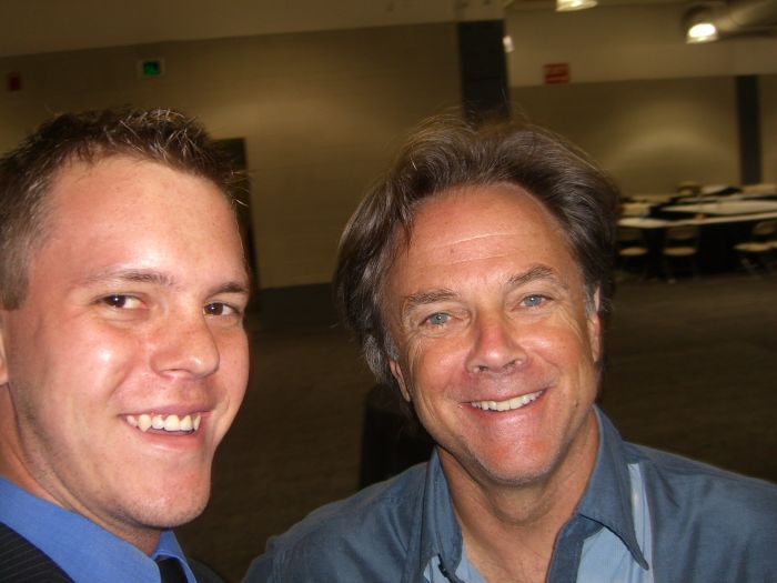
Andy with his major design crush, David Carson, 2005.
BH:
Thinking about your own work, how do you know when something is good?
AW:
Oh man. Well, there are levels of good for me. So there’s this really hard-to explain, intangible, gestalt of image and type and symbol that, if it’s all in balance, I know it’s good. And then there’s the kind of conceptual, like a poster that stops you in your tracks because you get the concept and you have to look at it twice. That kind of good. I know my own work is good when I can get a balance of the two of those things. The concept part is the hard part. The design is hard, but it comes with time. You keep iterating and you’ll get there. But the concept is difficult to get to.
A collection of rejected poster designs done by Andy.
BH:
How do you know when other people’s work is good? What are you looking for in a portfolio, for example?
AW:
Ok, so the dead giveaway for me of a good designer—somebody who’s got raw talent—is the variety of their work. It’s pretty easy to spot crutches for people in their design. For example, a portfolio I reviewed recently used all the same typeface, or maybe five fonts in their work. And I think they were comfortable there and they did a decent job, but I could tell they didn’t have true design talent because they kept relying on that same thing. The good ones are able to become chameleons for any given task, and their typography and raw layout design ability will stand out. And then there’s just the baseline typographic technique. I keep talking about typography, but that’s the language of any kind of graphic design. You can tell if somebody knows the language or not pretty immediately. I love looking at people’s multi-page publication design because it shows that they either get rhythm and storytelling, or they don’t. You don’t always get (that insight) with a poster and certainly not with branding, which is what most newcomers like to get into, but with publication design you can tell right away.
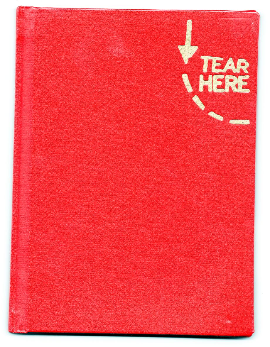
Andy's college senior thesis project, a book titled, "Tear Here: An Investigation of Ketchup Connections." It explores ketchup, a selection of topics associated with ketchup, and the interrelationship of those things.
BH:
I know you’re someone who’s pretty good at protecting the space and time you need to be creative. How do you manage that in an environment like a modern ad agency?
AW:
I probably don’t do it very effectively, honestly. One of the hardest things for me to learn when I became a creative director was how to trust other people to do the work. The other big thing I do is just saying no to things. That’s been a big learning process for me, and I’m still trying to figure it out. My work approach used to be doing a lot of everything, every day. Now I’m way more effective if I can block off big chunks of time to do things. Sometimes I’ll take an entire day just to tackle administrative issues. Or take an entire day just to immerse myself in a client, or be inspired and absorb as much great design as I can. For me, if I have 30 minutes here or there to be inspired, it’s just not going to happen. I can’t get much design done with little, tiny chunks of time. I’ve had to be really forceful and rigid—stubborn, actually—about not taking meetings, or not working on other projects so I can get that time.
BH:
This might sound like kind of a gotcha question at first, but bear with me. I notice you’ll turn off your email and Slack during the day as a way to protect these big blocks of time you’re talking about. Does it ever seem ironic to you that you have to unplug from interruptive digital tools so you can focus on creating new digital tools that are likely to interrupt people? What should the role of technology be in a world where most of us are fighting and losing a battle for quality time?
AW:
Yeah, that’s great way to frame that question. I mean, I guess you could say the same thing about anybody who chooses to be a designer or work in advertising. You know, “why do you want to go into that? Why do that when I’m beaten over the head with terribly designed inserts and brochures. Or, why would you want to go into advertising when it’s all I can do to get my ad blocker to work.” I think it’s totally up to us, as the people who are practicing it and spending a lot of time thinking about it, it’s totally on our shoulders to make things better. And to make the technology less of a nuisance. It’s the responsibility of interactive designers, as one example, not just to design things that are aesthetically pleasing and provide good user experience, but to design products that are non-addictive. We have an obligation to design things that complement sane, balanced lives. I don’t think we have to apologize if we’re rigorous in creating beautiful, graceful, useful things. I don’t think we can ever have too many of those.
